Slovakia Voter’s Guide, Part II

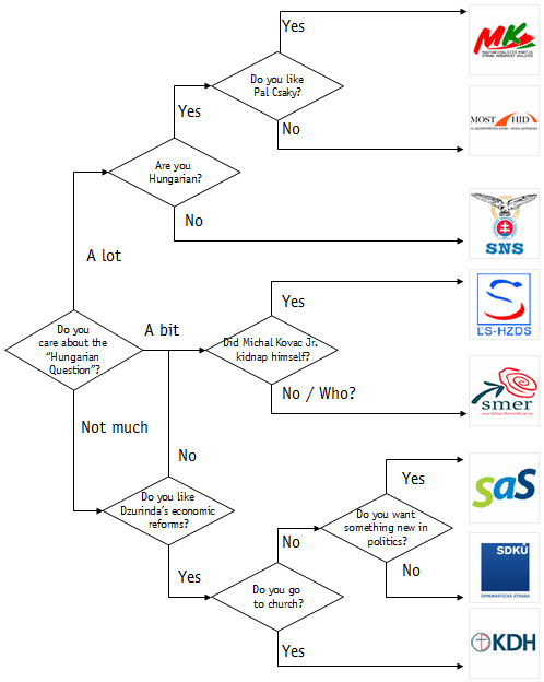
2010 Slovakia Voter’s Guide.

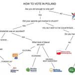
Four years ago in preparation for the 2010 elections, I came up with an (intentionally) simplified voter’s guide for Slovakia, designed as a flowchart.  No elections are coming up (unless Fico is serious about calling new elections, which I doubt but can’t rule out) but Ben Stanley did such an amazing job with a guide for Poland’s upcoming election in the Why We Study Eastern Europe facebook page) that I wanted to try again.

Poland Voter's Guide, Ben Stanley 2014

Poland Voter’s Guide, Ben Stanley 2014

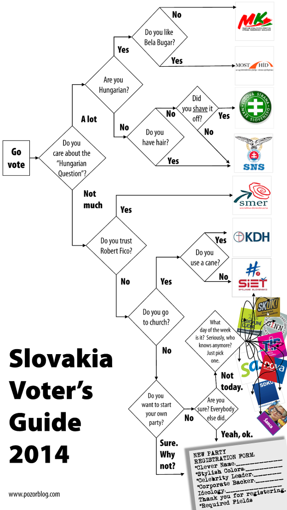
It has been only four years but circumstances are already different.  One party from the 2010 chart is formally gone–HZDS–and several others are in significant decline–SDKU, SaS–and we are seeing an amazing proliferation of entrants (a sort of “Hundred Flowers” campaign, only for parties).  The new chart highlights that newness in a way that is perhaps more biting than I intended, but /is/ remarkable to see one part of the political landscape of any country so divided.  Slovakia’s “right” (by which I mean non-nationalist, non-Hungarian, non-Fico parties) is split up among more parties than the entire Swedish parliament and it has the same adjusted party system size (over 5.0 according to the Taagipera and Laakso formula), and more seem to be popping up every week.

This must be a prelude to some sort of consolidation but if it doesn’t happen /before/ the election, then Slovakia’s right will (again) give away its chance to triumph over Robert Fico.  Even if the right doesn’t lose its necessary margin to small parties, it will face problems: according to FOCUS’s most recent poll, the right and Hungarians could scrape together a majority only if all five elected parties joined together.  The last so-called “zlepenec” coalition had only four (with a fifth one inside, to be sure) and lasted less than two years..  No wonder that some say KDH is thinking seriously about a coalition with Fico.  Or that new parties keep popping up to try to unify the right under /their/ banner.  Alas, the result is usually simply more fragmentation (see xkcd.com: http://imgs.xkcd.com/comics/standards.png).

So with all that buildup, here’s the chart.  And here it is in PDF: slovakia voting flowchart 2014 portrait

slovakia voting flowchart 2014 portrait_sm


Party or Popsong!

partyorpopsongI am, I must admit, a latecomer to the Eurovision Song Contest, aving not I discovered until 2007 when I was forced into a head-on confrontation when it(or at least the outdoor portions of it )happened right next to the Joint Sessions of the European Consortium for Political Research. But once I saw it, I couldn’t quite look away, and it has become an annual fascination for me (and now for my entire family). Recently these two worlds collided again and I realized that the weird names of new parties would fit very nicely into the song contest–and vice versa. They are so similar, in fact, that I am dare the people of the internet to try to figure out which is which. And so in the spirit of the recent “IKEA or Death”, I’ve developed (with the enormous help of Graham Hukill in my university’s Office of Teaching and Learning) a little game called: Party or Popsong. Can you tell the difference?
http://www.pozorblog.com/party_or_popsong/.  So let the voting begin!

Just in time for Christmas

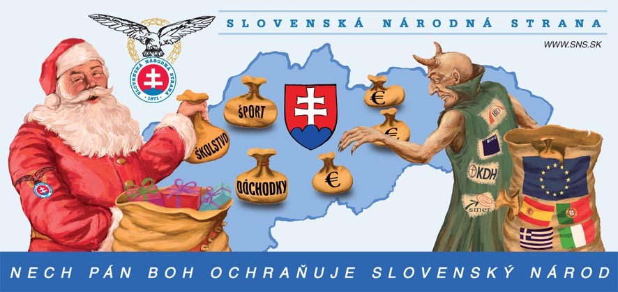
Slovakia’s first winter election creates all sorts of new possibilities. Several weeks ago the Slovak National Party tested the limits with a new billboard guaranteed to raise eyebrows:

The most surprising thing about this, however, is not its characterization of the EU stabilization (benefiting Greece, and Spain and Portugal and Italy) as the work of the devil.  That’s pretty normal for Slovakia’s politics (and particularly so for SNS).

Equally unsurprising, but rather more unsettling, is the depiction of a Santa wearing a political armband, and not just any red armband, but one that includes an eagle clutching a round symbol with clear straight lines set against a deep red background.

Slightly more surprising is the demon’s choice to wear fashion with designer labels not only by the current government parties SDKU, KDH and Most-Hid, but also SNS’s recent (and, from its perspective only potential future) coalition partner, Smer.  Of course Smer joined with the others in supporting the Euro stabilization, but this may be a sign that SNS will (like SaS on the other side) make strong use of the Euro question in its campaign.  The question is whether in trying to pull voters back from Smer, it also pushes Smer to the other side, though this may not be that big a risk since Smer has shown itself inclined to pick the weakest coalition partner, and it is hard to imagine that not being SNS (assuming it crosses the 5% threshold).

But the surprises don’t end there.  I had a nagging feeling about this that was confirmed by Martin Votruba of the University of Pittsburgh.  Martin writes:

The telling thing … is that SNS [despite its nativist approach] is dragging in an alienimage for Christmas, [using the traditional American icon of Santa Claus instead of the] traditional depiction of Jezisko (Baby Jesus) who brings presents.

[Furthermore,] images like the one on the SNS billboard were first imported from the Soviet Union as Dedo Mraz (Grandfather Frost) to replace Jezisko and imposed on people, with no success except in public St. Nicholas and Christmas events, and now by advertisers as Santa.

Many don’t care, of course, but there’s been a good deal of internet comments in the past on advertising that uses Santa Claus, in which people ridiculed ad statements like “Santa Claus will bring you…” [and noted that] that the manufacturers/advertisers clearly don’t have a clue that presents in Slovakia are brought by Jezisko.

This “alien” image brought in to represent the Slovak National Party is very much like when HZDS in its nationalist fervor put up billboards in the 1990s with images of “Slovakia” where the pastoral landscape in front of the the highly symbolic Tatras mountains turned out to be a stock picture of the Swiss countryside.

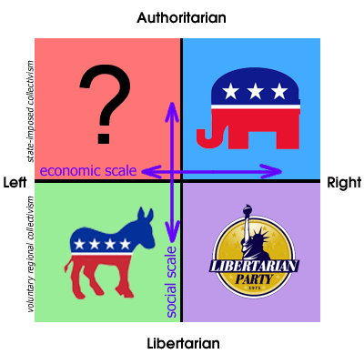
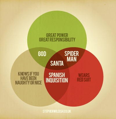
I am personally glad to see this usage by SNS as it helps to reinforce a point raised by a colleague of mine during Detroit’s Noel Night celebration as we passed an “Occupy Detroit” activist dressed in a Santa suit.  He noted the interesting juxtaposition between Santa’s apparently left-wing socio-economic ideology (giving stuff away for free) and his rather right-wing cultural predispositions: demanding to know who is naughty or nice, engaging in surveillance about whether children are awake or asleep.  This insight actually helps me solve a teaching problem that has been troubling me for a long time.  When I teach American politics (or indeed the politics of almost any country), I try to point out that political competition may be multi-dimensional, and that in many countries there is a disconnect between the economic and the cultural.  I often have students take online tests like, The Political Compass or Idealog which print out their results on 2-dimensional charts like this one.

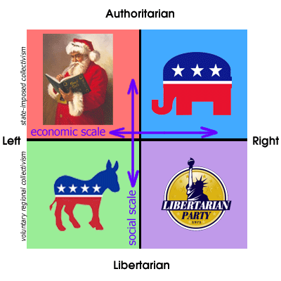
One of the problems with this, however, is that of the empty quadrant: America’s two major political parties occupy the lower left and upper right, and students can see that the Libertarian party occupies the lower left, but who’s the opposite of the libertarian?  Who in the United States believes in widespread distribution of selective benefits while at the same time demanding strict adherence to cultural norms?  Pat Buchanan?  Maybe, sometimes.  The real answer, clearly, is Santa.

Postscript.  Santa’s hot these days.  If you don’t like the SNS ad or my own infographic, try this one.

Post-Halloween Edition: Vlad the Impaled

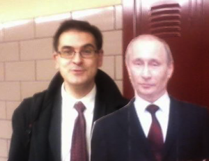
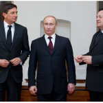
I’ve wanted to post this for some time but did not dare to do so until I knew it would work out. Now it has and I can reveal the identity of the guest in yesterday’s Democracy class:

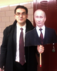
But before you say, “what a bad Photoshop job!” you should know that I would never stoop that low to put myself into a picture with a famous person.  I might, however, resort to this:

More complicated?  Sure, but much more practical for Trick-or-Treat (and for classroom dialogs about Russia).
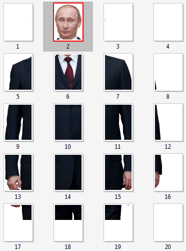
But, you might ask, “Where can I get a cardboard cutout of Putin to use in my own quest to scare adults and/or engage students in discussion?”  Well you could try one of the many vastly overpriced cardboard cutout vendors online, or you could find a high-rez picture of Putin, photoshop out the background, print it across multiple sheets, arrange them on a piece of cardboard, secure them with spray adhesive and add a stick. 

Since that’s too complicated for all but the most obsessive (of which I am obviously one), I offer below a completed version of the first 3 steps: your-own-life-sized-putin-cutout.pdf.*  Print out pages 2,5,6,7,8 for the short form, or add 9-20 for the long (if not quite full length) version.  Just print out, add cardboard, and stick, and voilà.  

*Wetsuit, equestrian and tiger-tranquilizing gun outfits sold separately.

I realize that this introduces a significant gender bias to the costumes, so I promise that by next Halloween I’ll finish the long-awaited Yulia-Tymoshenko-in-a-leather-space-suit cutout, though at the moment of my writing, the space available to her is rather smaller.


Credits:  While I am the proud owner of the Tymoshenko poster, I am thankful to Dominic Nonni for snapping the picture at the top and to the Slovenian Press Agency for putting its pictures in the public domain under a Creative Commons license (http://commons.wikimedia.org/wiki/File:Vladimir_Putin_in_Slovenia_in_2011_(11).jpg), though perhaps they just want everybody to see how Prime Minister Pahor towers over Prime Minister Putin.


National Identity and Beer Advertisements

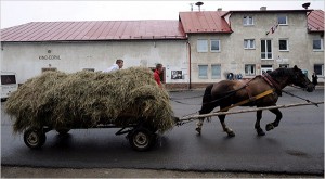
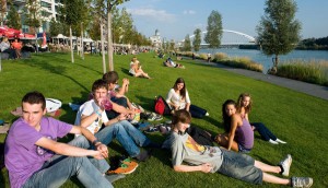
The New York Times broke tradition yesterday and published an article about Slovakia without a picture of a horse and cart:

A history of Slovakia according to The New York Times
Slovakia 2009 Slovakia 2011

The article in question starts with a nice reference to a recent ad for Zlaty Bazant which contains the line “Wanting to borrow from everybody? That’s Greek.  Not wanting to lend to Greeks? that’s Slovak” and becomes a symbol in the article for Slovakia’s reluctance to participate in the bailout as well as a generally skeptical attitude toward broader Euro and European structures (though the NYT piece mistakenly cites the ad as saying “not wanting to lend to anybody” as opposed just to “not wanting to lend to Greeks”).
&nbsp

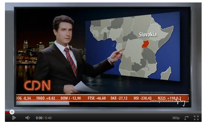
What the Times article doesn’t say is that the ad begins with another national critique, that is in some ways even more pointed:

Not knowing where Slovakia is?
That’s American.

Versions here  http://www.youtube.com/watch?v=gIr7jMDKw-k
and http://www.youtube.com/watch?v=jDaCiGF8wRw

I have to give the ad producers credit for giving the actor great news anchor hair, and it is hard to take issue with the critique given the record of major American news outlets.  A few examples (click to enlarge):

Fortunately for my tender national sentiments, Americans are not the only ones to come under fire.  Czechs get it too:

Having a thousand in your pocket and acting as if you have two, that’s Czech.  Having two in your pocket and acting like you have a thousand?  That’s Slovak.

Nearly everybody else gets it as well:

Marrying a Slovak woman?  That’s English, Italian, Austrian, UAE.  Marrying a Slovak man?  That’s Slovak.

Germans come off as organized but uptight and French cuisine is odd and skimpy while Slovaks have big appetites for unhealthy food and can find things even on a messy desk.  What is most interesting to me here is the notion of Slovak self-identity that is portrayed here: disorganized and sloppy but clever and generous.  It’s actually interesting that this is not all that different from Czech self-identity in the face of the Austrians in The Good Soldier Svejk.
And speaking of beer-related identity discussions, it is notable how much the Bazant ad has in common with its counterpart the “I am Canadian” ad produced by Molson a decade ago, which likewise pokes fun at the arrogance of larger countries while expressing a bit of (self-deprecatory) hometown pride.  Do other countries produce similarly national beer ads?  Do tell.

Found Art! Enter to win in the “Gerryvision 2011” Drawing Contest

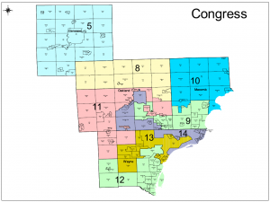
Those who would criticize American art as sterile and commercialized have obviously not familiarized themselves with the art of Congressional district boundary drawing which, like certain kinds of locust, flourishes once every decade (sometimes more often in Texas), feeding on census data and political desire.  And this year local Michigan artists have done their state proud with some remarkable work.  The beauty of these creations is often lost in a jumble of shapes and colors when they appear together on the same page:

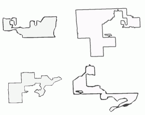
And so I would like to take this opportunity to present them as separate designs, each beautiful in its own right.  Ladies and gentlemen, the 9th, 11th, 13th and 14th Congressional districts of the state of Michigan:

Draw your own and win!

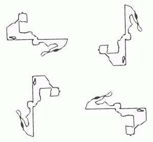
These shapes are not only remarkable for their raw beauty and complexity but also for the way in which they are open to interpretation.  Indeed perhaps the most exciting part of this American artistic tradition is the degree to which it  invites viewer participation.  And just as commentators compared one of Massachusetts Governor Elbridge Gerry’s 1812 districts as a “salamander” and drew a famous cartoon to illustrate, so all Americans are entitled to offer words and pictures to describe their new districts, so I ask all Pozorblog readers to do the same.   Take District 14 for example.  Look at it from all sides:

Is it a frog?  a giraffe riding a motorcycle? Elvis?  You decide and then send it here so that it can be posted for the world to see.  And if you do it soon, there’s something in it for you (in a sense):

Gerryvision 2011

The process is simple:

  1. Download one or all of the maps below in pdf or jpg format
  2. Look at it long and hard, rotate it, squint at it or do anything else that will help you to divine its true shape.
  3. Mark up the graphic to show what you have in mind.  Feel free to print it out and draw on it
  4. Take a picture or scan it in and send it here: pozorblog@gmail.com by midnight on Friday, October 21.  Submit as many as you want!

Entries will be judged by an expert jury of experts in electoral rules (i.e. the students of my PS4710 course on “Democracy”) who.  The winner will receive $10 donated in her/his name to the charity of her/his choice.

Here are the maps.  Go ahead and join the American artistic-political tradition!

Click the pictures below for graphic files or click here for a .pdf of all four
The 9th The 11th The 13th The 14th

As they used to say (and maybe still do), you can’t win if you don’t enter.

Party Personal-ism

I didn’t think that I would need to be the one to do this, but somebody needs to do make a visual comment on what passes for party building on the Czech left.  So I guess it’s up to me and Adobe Photoshop.

We saw this kind of love story in 2010, the two partners coming ever so close to the threshold:

In the same election we saw also saw the similar, if more convoluted story of Jana Bobosikova, late of the Independent Democrats, then Politics 21, then presidential candidate of the Communist Party, then, in partnership with the Party of Common Sense, “Sovereignty-the Bloc of Jana Bobosikova, Party of Common Sense”, and finally “Sovereignty-The Bloc of Jana Bobosikova”

Now it’s 2011 and time for another sequel, whose plot is nicely laid out in MF Dnes:
Paroubek vzdal kandidaturu na Hrad. Blíží se politický přestup roku.

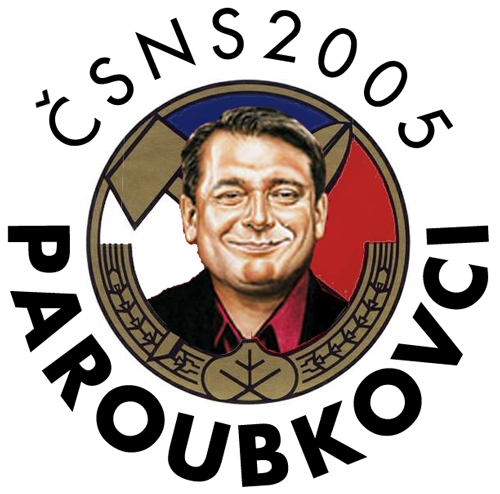
But this effort needs a logo.  Once again through the power of Photoshop, I offer:

Yes, it’s Zemovci II: Paroubkovci.  If that’s not quite clear enough,
there is room in the logo for some helpful supplementary imagery.

4.32% here we come!

You’re a mean one, Mr. Z.

Congratuations to MF Dnes for publishing one of the most sinister images of a politician I’ve ever seen.  (“No, Mr. Bond. I expect you to die.”)  It is also, in its way, one of the most beautiful.  Click on the image to see Milos Zeman’s hard-earned lines and crags.


Unfortunately, I think the text contains a misprint, suggesting that Zeman rejects Islam as “anticivilization” because of it’s relationship to women. I think Zeman actually was referring to something else even nearer to his heart.  Here’s the correct version, I think:

Make your own country name, part II. This time with real countries

This is the way the world ends, not with a b-a-n-g but with an -n-i-a.

At least that’s the way a good share of the world’s country names end. Having used fictional country data to make “maps” of the beginnings and endings of non-existent countries, it was an obvious next step to try it with the real world. So as with Ballnavia and Slaka and Molvania, I inverted the names on the United Nations member list (English-language version) and alphabetized by last letter and then arrayed them graphically with size representing frequency (actually it represents frequency squared, but I think that actually helps draw out the patterns). What I got was actually not much different from the results for make-believe Europe:
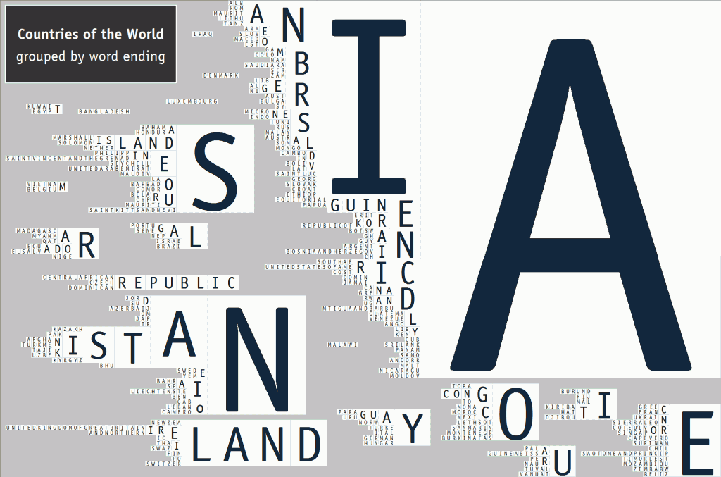
world-country-names-endings
I did the same with a normal forward-facing alphabetization. and again got a similar result, again suggesting that country beginnings are the source of much more variety than country endings.
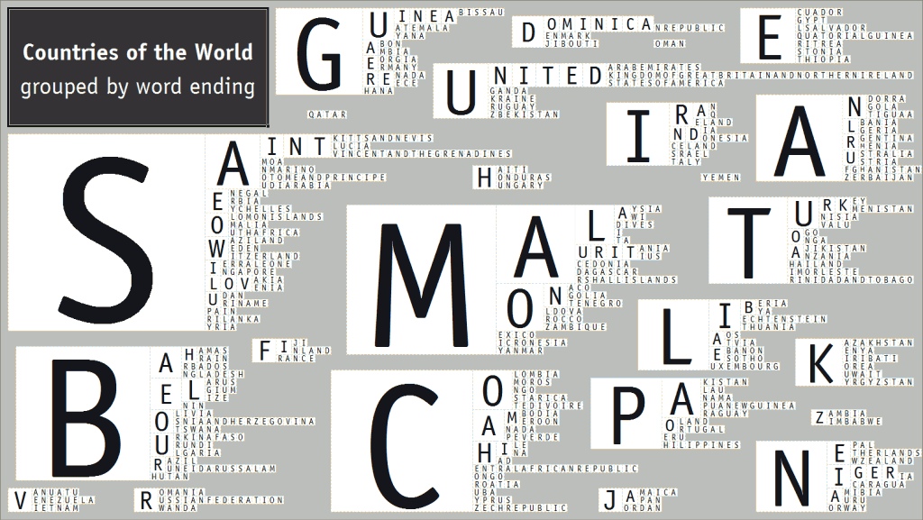
So from here it’s a simple step to yet another matrix of beginnings and endings, again ranked by my formula of “length of character string” times “frequency of appearance.”  Draw lines from prefix to suffix to make your own country names.  Add letters in between to increase the excitement:

Pts. # Prefix <————-> Suffix # Pts.
20 10 MA IA 37 74
18 3 UNITED LAND 9 36
16 2 DOMINICA STAN 7 28
15 3 SAINT NIA 9 27
15 5 MAL ISTAN 5 25
12 2 GUINEA REPUBLIC 3 24
10 2 NIGER TAN 8 24
10 5 CO ANIA 5 20
10 5 MO GUINEA 3 18
10 5 PA KISTAN 3 18
9 3 BEL ELAND 3 18
9 3 MON LANDS 3 15
8 2 MALA ICA 5 15
8 2 SLOV RICA 3 12
8 2 TURK MBIA 3 12
8 4 CA ERIA 3 12
6 2 BAH SIA 4 12
6 2 CHI KOREA 2 10
6 2 GRE NESIA 2 10
6 2 IRA ILAND 2 10
6 2 IND CONGO 2 10
6 2 LIB ES 5 10
6 3 AN ANA 3 9
6 3 BO INA 3 9
6 3 BU NADA 2 8
6 3 NE ANDA 2 8
6 3 SE ALIA 2 8
6 3 SO ENIA 2 8
6 3 SW ONIA 2 8
4 2 AL GUAY 2 8
4 2 AR DIA 2 6
4 2 AU VIA 2 6
4 2 BR DAN 2 6
4 2 FI AIN 2 6
4 2 GA DOR 2 6
4 2 GE LA 3 6
4 2 JA TI 3 6
4 2 LA AL 3 6
4 2 LE CO 3 6
4 2 NA AR 3 6
4 2 PO OS 3 6
4 2 SI US 3 6
4 2 SU YA 2 4
4 2 TO CE 2 4
4 2 TA EN 2 4
AS 2 4
AU 2 4

And what can we take from this?  Well, if you’re a serious, reality-minded person, not much.  But if you like to make stuff up and tell stories and have fun with words, then you get some great new opportunities to create things that sound like countries but really aren’t.  Below, in alphabetical order, because I can’t pick a favorite, is a partial list of some of the possibilities.  Some are just variations on existing country names with the right amount of detail in the prefix:  Malistan and Malaguay sound about right, with the right number of syllables and are enriched by the common prefix “Mal”–with its ominous undertones in Latin and its implication of smallness in Slavic languages).  Mondor, too, sounds sinister, though not quite as bad as its its Middle-Earth counterparts.

Among the others, I like the triple combination of Tailand, Toeland and Toiland (somewhere between Santa’s workshop and the nearby WC).  Two others–Monica and Nadia–highlight the similarity between country names and Indo-European names for females.  Panada and Swina sound vaguely like animals.  Many sound like serious medical conditions, especially Annesia, Mania, Maleria and Maladia.  And there are some that end in the “ya” sound, and begin with verb-sounding prefixes.  Tasia sounds like “Tase ya” (no place for Andrew Meyer) and the same possibilities apply to Suya (a response, perhaps, to Tasia), to Bombia, and, somewhat less belligerently, to Combia and Boeria.  And one of the really nice things about the list is that contains at least two “real” fake countries:  Sodor, far more real to most 4-year-old Thomas the Tank Engine fans than the country in which they actually live, and Catan, equally real to many players of German-style board games.  So, to would-be game designers, authors of children’s stories, and all those others who want to see their name in lights, I say use the chart.  Neonia is within reach.

  • ANANA
  • ANNESIA
  • BOMBIA
  • CATAN
  • COMBIA
  • COSIA
  • FINESIA
  • IRAMBIA
  • MALADIA
  • MALAGUAY
  • MALERIA
  • MALISTAN
  • MANIA
  • MONDOR
  • MONICA
  • NADIA
  • NEONIA
  • PANADA
  • SAINT REPUBLIC
  • SODOR
  • SUYA
  • SWINA
  • TAILAND
  • TASIA
  • TOELAND
  • TOILAND
  • UNITEDLAND


P.S. It’s hard for me not to notice that Sodor Railways logo on the Wikipedia page, while obviously lovingly crafted by a fan with strong graphics skills also bears a striking and unfortunate resemblance to another not too different insignia with a black squiggly line inside white circle on a dark red field.   As Marta von Trapp wisely observes in The Sound of Music, “Maybe the flag with the black spider makes people nervous!”